

Damoh air quality map
Live air pollution map of Damoh
173 people follow this city

Full screen


Contributors category
0
Government
0
Educational
0
Non-profit organization
0
Corporate
0
Individual
0
Anonymous
Station(s) operated by
*IQAir’s AQI data modeled using satellite data. Learn more
Health Recommendations
 | Sensitive groups should reduce outdoor exercise |
 | Close your windows to avoid dirty outdoor air GET A MONITOR |
 | Sensitive groups should wear a mask outdoors GET A MASK |
 | Sensitive groups should run an air purifier GET AN AIR PURIFIER |
Damoh does not have air sensor data
Be the first to measure and contribute air quality data to your community.
News
The latest air quality news and resources.


Understand air pollution and protect yourself
Damoh MAP AIR QUALITY ANALYSIS AND STATISTICS
Is there a lot of interesting information about air quality on the air pollution map for Damoh?
Clicking on the map icon at the top of the main city page will open a new page dedicated to providing all the information about air quality in and around Damoh city.
Once this new page has opened, the overall colour of the entire map will be very noticeable. It carries the colour which represents the current state of the air. At present, it is yellow which indicates “Moderate” air quality.
Usually, there will be several coloured circles scattered across the map which represent the locations of the ground-level air monitoring stations. However, not all cities have such physical units because they rely on overhead satellites for their data about air quality. Damoh is one of these cities that rely on satellites for their information.
If the map is expanded, some of the discs can be seen around New Delhi. All of the discs display a number at their centre which is the United States Air Quality Index reading or US AQI for short. The colour of the discs signifies the state of the air and is standard across the IQAir website. The colours can range from pale green to dark maroon where the darker colours represent worsening air quality.
The figure is calculated by taking the measurements of up to six of the most commonly found pollutants in city air. They are usually both sizes of Particulate Matter (PM2.5 and PM10), ozone, nitrogen dioxide, sulphur dioxide and carbon monoxide. Once this figure has been established it can be used as a metric when comparing air quality in different cities across the globe. Its use is encouraged by the World Health Organisation (WHO).
Looking back at the main city page, it can be seen in the coloured banner at the top of the page that the air quality was classified as being “Unhealthy for sensitive groups” with a US AQI reading of 103. The colour of the banner also reflects this. The main pollutant was identified as PM2.5 with a recorded level of 36.2 µg/m³ which is over seven times higher than the suggested target figure of 5 µg/m³ as recommended by the WHO.
Is there any more interesting information about air quality to be found on the air pollution map for Damoh?
There are lots more very interesting facts and figures about the air pollution in Damoh and they are easy to find from the main city page. When the new page first opens, an icon will be seen at the top of the page which needs to be selected to re-open the page at maximum size.
When the page is at maximum size, there will be a list of four options seen on the left-hand side of the screen. These can each be turned on or off which lets the viewer see the changes they each make on the map.
The first option would reveal the locations of the ground-level air monitoring stations, but as already stated, Damoh does not have any physical stations because they get their information from satellites.
The second option shows the location of any wildfires that might be burning out of control in the area. Currently, there are three fire icons on the map but they all appear to be quite a distance from the city. Option four shows the speed and direction of the prevailing wind and can give an idea of where the smoke from the fires may blow.
The third option can change the background colour of the map to reflect the current state of the air. If the air quality is poor, the map will take on a very dark colour which some may find distracting, in which case, the option can be deactivated and the map will change to a more subtle hue.
There is more information about air quality on the right-hand side of the page where a table will be found. This table shows the ranking of the world’s top seven most polluted cities. In order to see the rest of the participating cities, the full ranking section needs to be explored.
Can the source of the polluted air be seen on the air pollution map for Damoh?
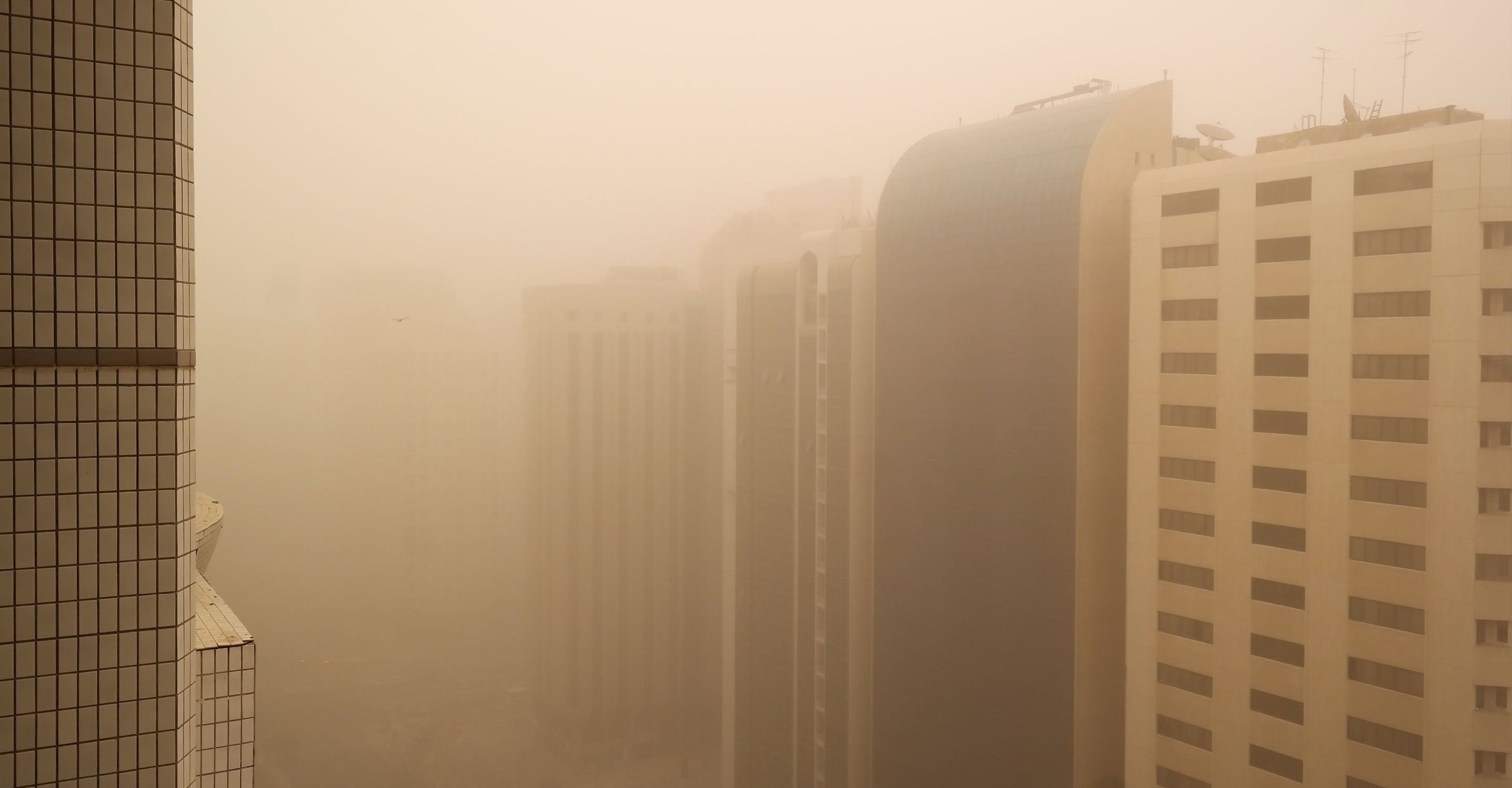
Whilst the origin of the polluted air is not directly shown on the air quality map for Damoh, it is well-known that the pollutants released by modern industries, various transport vehicles, power plants, factories, combustion processes, agricultural processes, energy processes etc. have created a major problem. Air pollution is mainly caused by rapid industrialisation and urbanisation. Air pollution is maximum in metropolitan cities of India.
As soon as the winter season comes, the problem of air pollution increases a lot and it affects our lungs the most. Continuous exposure to polluted air causes a lot of damage to the lungs. Unhealthy air also increases the risk of many respiratory diseases. It is very important to live in fresh and pollution free air for good health.
PM2.5 is always seen on the air pollution map for Damoh, but how dangerous is it?
PM2.5 refers to extremely small particles with a diameter of 2.5 microns (micrometres) or less suspended in the atmosphere. Also known as "microparticulate matter", it consists of various components such as carbon, nitrates, sulphates, silicon, sodium, and aluminium. These various materials contained in PM2.5 can cause various respiratory tract disorders such as acute respiratory infections (ARI), lung cancer, cardiovascular disease, premature death, and chronic obstructive pulmonary disease.
PM2.5 has very fine particles, so when it is inhaled, it enters the narrow bronchi and deep into the lungs as far as the alveoli. Therefore, it is said to increase the risk of respiratory diseases such as asthma and bronchitis. In addition, there is concern about the effects on the circulatory system, such as arrhythmia.
PM2.5 is generated directly from the incineration of things and the combustion of gasoline cars and stoves. Furthermore, sulphur oxides and nitrogen compounds emitted from thermal power plants and factories, and volatile organic compounds generated from solvents and paints cause chemical reactions in the presence of sunlight in the atmosphere, resulting in secondary emissions.
Stay Informed. Download #1 air quality app
Air pollution forecast, pollution alerts and much more to help you plan your days and keep protected against air pollution


